When talking about Data Mining methods people tend to refer to numerical methods mostly. However, there are many reasons to consider visual approaches to data mining as equally important. We start with a concise discussion of numerical data mining methods and expand a little bit more on visual data mining later.
Decision trees are popular and powerful methods to classify cases as well as to predict values. Their attractiveness is mainly due to the fact that the basic principle of tree-based methods as well as their outcome are easy to understand. The basic principle is the hierarchical division of all observations into subcategories in such a way that the resulting subcategories differ from each other as much as possible while the subcategories itself are as homogenous as possible. The outcome of a decision tree is a rule that can easily be expressed in plain English and as easily in any data base query language to quickly and repeatedly apply it to new data.
Decision trees are a supervised learning technique and require that we can extract a target variable. Depending on the scale of the target variable two types of decision trees are distinguished: classification trees, if the dependent variable is categorical, and regression trees, if the dependent variable is continuous. A full analysis with decision trees comprises two steps, growing a tree and pruning a tree.
![\includegraphics[width=13cm]{text/3-13/rochtree.eps}](img6691.gif) |
Let us briefly describe the basic principle of growing a binary tree.
Given observations for ![]() cases on the dependent variable
cases on the dependent variable ![]() and
and ![]() explanatory variables
explanatory variables
![]() we first assign all cases
into the root node of the tree. The typical algorithms are greedy
algorithms that enumerate all possible splits to find the best split
for the current node under investigation. Thus, for each explanatory
variable
we first assign all cases
into the root node of the tree. The typical algorithms are greedy
algorithms that enumerate all possible splits to find the best split
for the current node under investigation. Thus, for each explanatory
variable ![]() all possible splits between values are examined. During
this examination the cases in the node are partitioned into two groups
(for binary trees) and a diversity measure is calculated for each
potential subnode. Commonly used diversity measures are deviance,
entropy, misclassification rate, and the Gini coefficient. The one
split that yields the largest information gain will be taken.
Information gain is measured here in terms of the decrease of the
diversity measure when going from the parent node to the subnode. The
algorithm uses the same process recursively to build a decision tree
for each subnode. A node will not be further split if it is pure or
if one of the subnodes would contain too few cases. There are mainly
three families of tree growing algorithms:
all possible splits between values are examined. During
this examination the cases in the node are partitioned into two groups
(for binary trees) and a diversity measure is calculated for each
potential subnode. Commonly used diversity measures are deviance,
entropy, misclassification rate, and the Gini coefficient. The one
split that yields the largest information gain will be taken.
Information gain is measured here in terms of the decrease of the
diversity measure when going from the parent node to the subnode. The
algorithm uses the same process recursively to build a decision tree
for each subnode. A node will not be further split if it is pure or
if one of the subnodes would contain too few cases. There are mainly
three families of tree growing algorithms:
The impurity of a node ![]() is a nonnegative function
is a nonnegative function ![]() such that
such that
Some very common splitting criteria based upon impurity measures are:
 |
 |
Another splitting rule, which is not based on an impurity measure, is
the twoing rule: A node ![]() is split into a left and a right
node
is split into a left and a right
node ![]() and
and ![]() such that
such that
 |
As [6] point out, the choice of the algorithm used is not as crucial as is generally thought:
within a wide range of splitting criteria the properties of the final tree selected are surprisingly insensitive to the choice of splitting rule (p. 38).
[11], however, mentioned several problems concerning impurity functions for splitting nodes, for instance
It [the Gini index] has a tendency to produce offspring nodes that are of equal size (p. 69).
Unfortunately, there is no such thing as an optimal splitting criterion. ''Optimal'' splits very strongly depend on the specific application. When a decision tree is grown, many of the branches will reflect particularities of the training data at hand and will not generalize very well to the test data. This phenomenon is called overfitting, and pruning the tree is a method to address this issue. The prepruning approach tries to implement the pruning process already in the growing phase. For this purpose, an additional stopping criterion is built in. At each node, a split is only performed if the information gain exceeds a certain threshold. Postpruning reduces the complexity of a tree model by removing the branches of some nodes. Postpruning is more effective, especially when the decision to remove a branch is based on a diversity measure that differs from the one used in the growing phase. Prepruning requires less computation but typically does not avoid the problem of overfitting and leads to rather unreliable trees. Postpruning is often a semi-automated process, including manual interactive pruning as well as cross-validation techniques.
Classification trees have been used as a role model for a predictor in bagging ([5]). Bagging as well as boosting ([9]) are used to improve the accuracy of a single prediction method by gaining stability and robustness, see also Chap. III.16.
Artificial neural networks are one of the most prominent data mining techniques. Their fame is two-fold: famous for astonishing good prediction results, unfamous for their black box behavior and lack of reproducibility of achievements. Neural networks are a classical method for predictive modeling. They have been used for classification and prediction to a similar extent. The basic idea of neural networks is the perceptron (see Fig. 13.3), a feedforward neural network with an input layer and an output layer.
The nodes of the input layer serve to introduce the values of the
input variables. In a supervised learning situation with ![]() explanatory variables and
explanatory variables and ![]() cases, we hence get a network with
cases, we hence get a network with ![]() input nodes and
input nodes and ![]() output nodes. For each output node
output nodes. For each output node
![]() the model output is calculated as a weighted sum of transformed
input values
the model output is calculated as a weighted sum of transformed
input values
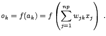 |
The simple perceptron only allows to solve linearly separable problems. To address more complex problems a multi-layer perceptron, also called feedforward network must be used. A multi-layer perceptron (see Fig. 13.4) introduces additional layers, so-called hidden layers, into the network topology. Each node in the hidden and output layers operates in the same way as an output node in the perceptron. The lack of original target values for the nodes in the hidden layers is remedied by the backpropagation strategy. This means that the present network topology is used in two ways: as a feedforward network to propagate the observed values of the explanatory variables to the output layer and in reverse order to propagate the errors of fitted values back to the input layer.
A huge variety of different models can now be achieved by using different activation functions or different network architectures, i.e. by specifying the links between nodes. Usually, one uses the same activation function for all nodes in the hidden layers. The standard way of network architecture is to fully connect all neurons to all of the units in the preceding layer. However, it is possible to define networks that are partially-connected to only some units in the preceding layer. Typically, the resulting fitted values will be the same (or at least very similar) for different network architectures, summarizing in a nutshell the characteristics of a neural net: often very good in predicting and fitting values but giving very few insight into the functional relationship between explanatory variables and target variable. Putting it the other way round: neural nets are the method of choice, if you have no idea about the functional relationship between explanatory variables and dependent variable. If you have a strong hypothesis on the functional relationship it is usually preferable to include this knowledge in the modeling process.
Memory-Based Reasoning (MBR) tries to mimic human behavior in an automatic way. Memories of specific events are used directly to make decisions, rather than indirectly (as in systems which use experience to infer rules). MBR is a two step procedure: first, identifying similar cases from experience, secondly, applying the information from these cases to new cases. MBR is specifically well suited to non-numerical data. MBR needs a distance measure to assign dissimilarity of two observations and a combination function to combine the results from the neighboring points to achieve an answer. Generating examples is much easier than generating rules which makes MBR so attractive. However, applying rules to new observations is much easier and faster than comparing new cases to a bulk of memorized objects.
Rule induction methods are widely applied tools for mining large data bases. They are often used as a starting point in undirected data mining, i.e. when you do not know what specific patterns to look for. One form of rule induction methods are association rules well-known in market basket analysis. They were proposed by [1] with the intention to provide an automated process, which could find connections among items, that were not known before, especially to answer questions like: ''which items are likely to be bought together?''. Many other areas of applications have been named from customer-tailored packages in the telecommunication or insurance business to analyzing web links.
In general, an association rule is an implication of the form
![]() , where
, where ![]() and
and ![]() are mutually exclusive item sets.
The quality of an association rule
are mutually exclusive item sets.
The quality of an association rule
![]() is measured by
two criteria: confidence
and support.
A rule holds with confidence
is measured by
two criteria: confidence
and support.
A rule holds with confidence
![]() , if
, if
![]() % of transactions in
% of transactions in ![]() that contain
that contain ![]() also contain
also contain ![]() . The
rule
. The
rule
![]() has support
has support ![]() in the database
in the database ![]() ,
if
,
if ![]() % of transactions in
% of transactions in ![]() contain
contain ![]() .
.
Most data mining software offers a procedure to generate all association rules with confidence and support that exceed some user-specified minimum thresholds for support (minsup) and confidence (minconf). The procedures are typically based on the a priori algorithm introduced by [2].
There are several problems related to this procedure: the setting of the thresholds of minimal support and confidence is crucial; choosing high support and confidence may lead to ''uninteresting'' results - insofar as the resulting rules are often trivial or well known beforehand by domain experts ([35]). Lowering the minimal thresholds can lead to a vast increase of the number of results. The standard approach is hence to use low thresholds for generating a large number of rules and then prune these rules to a manageable number of patterns. Pruning methods are based on objective or subjective interestingness measures. Confidence, support, information gain, Gini-coefficient, entropy, and lift are some of the widely used objective measures ([3]). Subjective measures try to incorporate user and domain knowledge to adapt the resulting rules to the current situation: a pattern which is if interest to one user may be of no interest to another user ([29]). However, it is typically not easy for the user to put his/her expectations and knowledge into automatic procedures of rule pruning. [23] use rule templates to model the user's knowledge, while [29] introduce belief systems to describe users' expectations.
Another source of problems stems from the inability to estimate the quality of a rule merely from the two keys confidence and support. Graphical solutions showing a rule in the background of the corresponding contingency table have been proposed by [18]. Interactive methods further enhance these displays to powerful tools in the exploration of association rules, see [19].
Data visualization can contribute to the Data Mining process in many
different ways, primarily because the human visual system is excellent
in discovering unexpected patterns. Visual data mining does not
replace other methods, but it complements analytic
approaches. Standard numerical methods to detect outliers and
erroneous observations are easier to automate and they may uncover
most of the problems in a data set but graphic displays are excellent
at identifying and understanding new and unusual problems in the
quality of the data. Visualization techniques have met interest in the
data base and data mining community since the early 90s, where they
have been extensively used to represent results of dynamic data base
queries ([28,21,25,26]). The
parameters of the query are visualized by sliders each representing
the range of one query parameter. The user can change the sliders
interactively and the query results are shown in a linked
graphic. Different methods to represent the distances between the
query and the data items have been proposed in the literature:
pixel-oriented techniques [22], different intensities of the
highlighting color ([32]), or the standard linked views
approach using a ![]() -distance ([7]). More recent
discussions of visual approaches to data mining tend to use complex
static graphics more suited for presentation than for analysis. (For
examples, take a look at websites concerned with Data Mining.) This
may be for two reasons. Graphics research in computer science has
been concerned with sophisticated, computing-intensive displays (for
instance in scientific visualisation) and so it is natural to develop
methods of this kind. On the statistical side, commercial software
lags substantially behind graphical research. Few packages provide
the flexibility and interactivity in graphics that is essential for
exploratory work and, of those, even fewer have made provision for the
display and graphical investigation of large data sets. Looking at
the scatterplots produced by software for large numbers of data points
can reveal more about the software than about the data. The
capabilities of graphic displays for initial explorations of a data
set are past comparison. Graphic exploration to grasp the main
structural features and to get to know the data before beginning
formal analysis can be carried out swiftly and informatively. It is
not just the graphic displays themselves that are necessary, but the
ability to directly work with them: to query points, symbols or axes;
to select and link cases across displays; to sort and group data; to
rescale and zoom. Interactivity not only means that the user can
interact with the data, but also that the results from the changes
made by the user can be seen instantaneously. A rapid and responsive
interaction facilitates active exploration in a manner that is
inconceivable with static displays. Users can start to pose ''What
if'' queries spontaneously as they work through a task. Therefore,
interactive displays not only offer the possibility of comparing
resulting static views of different aspects of the data, they even
encourage to draw conclusions from the way things are
changing. Visualisation is also valuable for checking, filtering and
comparing results from analytical procedures, and communication of the
final outcome to the data base owner and the decision makers is
indispensable without charts. At all these stages of the knowledge
discovery process, at which contact with domain specialists is
important to turn data into knowledge, the advantages of graphical
presentation of ideas to enhance communication are considerable.
-distance ([7]). More recent
discussions of visual approaches to data mining tend to use complex
static graphics more suited for presentation than for analysis. (For
examples, take a look at websites concerned with Data Mining.) This
may be for two reasons. Graphics research in computer science has
been concerned with sophisticated, computing-intensive displays (for
instance in scientific visualisation) and so it is natural to develop
methods of this kind. On the statistical side, commercial software
lags substantially behind graphical research. Few packages provide
the flexibility and interactivity in graphics that is essential for
exploratory work and, of those, even fewer have made provision for the
display and graphical investigation of large data sets. Looking at
the scatterplots produced by software for large numbers of data points
can reveal more about the software than about the data. The
capabilities of graphic displays for initial explorations of a data
set are past comparison. Graphic exploration to grasp the main
structural features and to get to know the data before beginning
formal analysis can be carried out swiftly and informatively. It is
not just the graphic displays themselves that are necessary, but the
ability to directly work with them: to query points, symbols or axes;
to select and link cases across displays; to sort and group data; to
rescale and zoom. Interactivity not only means that the user can
interact with the data, but also that the results from the changes
made by the user can be seen instantaneously. A rapid and responsive
interaction facilitates active exploration in a manner that is
inconceivable with static displays. Users can start to pose ''What
if'' queries spontaneously as they work through a task. Therefore,
interactive displays not only offer the possibility of comparing
resulting static views of different aspects of the data, they even
encourage to draw conclusions from the way things are
changing. Visualisation is also valuable for checking, filtering and
comparing results from analytical procedures, and communication of the
final outcome to the data base owner and the decision makers is
indispensable without charts. At all these stages of the knowledge
discovery process, at which contact with domain specialists is
important to turn data into knowledge, the advantages of graphical
presentation of ideas to enhance communication are considerable.
Research on interactive principles for statistical graphics can be categorized into two classes: firstly, development of innovative tools that help making a single display flexible and dynamic, and secondly, development of tools that operate on the underlying data and therefore have impacts to all displays showing the same data. Common tools of the first class are for example interactive modifiers of the bar width of a histogram, zooming in dot or scatter plots as well as slider-controlled dynamic changes in a graphic. The core of the second class are selection mechanisms and linking. Various selection modes that can even be combined to a sequence help in choosing a specific set of data points to assign interest to them. Linking is the basic concept giving graphical methods the capability of multivariate analysis. Linking builds up a relation between different observations and between different displays. It propagates the changes and selections made in one plot to all other connected plots that deal with the same database.
Data Mining is statistics at scale and speed. Large data sets can be large in two different aspects. First, if the size of the sample investigated is fairly large it will result in a large quantity of observations, the number of data points possibly going towards the billions. Secondly, a large data set can also arise from investigations with a large number of variables. For graphical as well as for analytical procedures both these issues pose problems and require new approaches for solution.
Graphical displays are often used to provide an easy overview of the
data from which the global structure can be rapidly deduced while it
is still possible at the same time to spot individual features. For
small data sets one can represent each data point by a single
graphical element, as for example in scatter plots in the form of
small circles, to ensure that all the information in the data is also
represented in the display. However, the use of point based displays
reaches its limits as the number of observations increases. A computer
screen with about
![]() pixels screen size
will possibly offer about one million pixels to be used for displaying
points the others needed for frames, scroll bars, legends, and
scales. Assuming that we need about five pixels to make a point
clearly visible a natural limit for point based displays would lie at
about
pixels screen size
will possibly offer about one million pixels to be used for displaying
points the others needed for frames, scroll bars, legends, and
scales. Assuming that we need about five pixels to make a point
clearly visible a natural limit for point based displays would lie at
about ![]() observations. This number decreases even more if we
take into account that the more structure a data set shows the less
spread out are the points over the display's range. Thus, most
realistic data sets will only use about a quarter of the available
area in a graphic and thus induce that we only can show about
observations. This number decreases even more if we
take into account that the more structure a data set shows the less
spread out are the points over the display's range. Thus, most
realistic data sets will only use about a quarter of the available
area in a graphic and thus induce that we only can show about
![]() observations in one point-based plot.
observations in one point-based plot.
Analytical methods reduce the dimensions and in the extreme case condense the data into one single number, like the mean or a regression coefficient. The graphical analogue is to use one single graphical element to represent the data. A single smooth density curve for example can be used to display the univariate distributional properties of data. Note here, that as in this example, a single graphical element can still convey much more information than a single number. The use of smooth density curves is not only marked by a reduction in terms of graphical elements but also by a transition from using position to encode information to using area instead. Histograms have a long tradition in statistics for being used to display distributional information. They are computationally simpler than smooth density curves and indicate their local constructional properties more clearly. So, for large data sets, area based graphics are to be preferred.
Graphical elements overlap when the values they represent fall too close together on the scale used in the current display. Brightness of the graphical elements can be used to visualize the extent of overplotting. The more graphical elements overlap the brighter they are drawn. One implementation of this is tonal highlighting as provided for dotplots and scatterplots in MANET ([17]). This procedure can be seen as a special kernel density estimation using a uniform kernel. Tonal highlighting and its visual effect is based on two parameters that can be interactively varied: the size of the graphical points used for displaying data and the maximum brightness parameter that is the number of data points that have to overlap to yield the maximum brightness.
For sparse plots brightness should change already with little overplotting, for dense plots a stronger overplotting is needed to cause a change in brightness, see Fig. 13.5.
![\includegraphics[width=11.7cm]{text/3-13/changebright.eps}](img6717.gif)
|
In contrast to point oriented displays in which dense areas cause problems due to overplotting, it is more likely that area based displays run into difficulties when regions have too few data points. The counts for such regions might be too small to result in an area that is perceptible to the human eye. Especially, histograms for highly unequally dense regions will cause representational problems: according to the scale used either the high density regions are visible or the low density regions.
Linking leads to a technical difficulty associated with large data sets and particularly relevant to data quality. Even with a high-resolution screen it may be necessary for each pixel to represent many points. If the number of points to be drawn or highlighted is too small to be represented, then those points will be invisible. This can lead to false judgments, for instance in masking unusual cases, and needs to be avoided. One solution, which works well in practice, has been implemented in the software MANET. Red-marking is used to indicate that some information may be hidden. For histograms and barcharts a red line is drawn under any bar where information may be hidden. It could be that the bar itself is too small to be drawn (which can happen with extreme values in histogram displays); it could be that too few are highlighted in a bar for any highlighting to show; it could be that too few are not highlighted in a bar so that the whole bar is, misleadingly, completely highlighted. A related problem arises in the display of spatial data: very small areas (often the most populous!) may not be shown and special red-marking techniques are needed to take account of this.
Direct manipulation graphics can alleviate this problem further when there is the possibility of easily changing the scale of a display. Here it is by no means sufficient to have a parameter tool box in which we can insert our desired scaling. We must be able to grab the vertical axis in a histogram to shrink or expand a scale by simply dragging it as well as breaking a scale and using different scalings at different parts of the range. Such a feature can be thought of as a particular variant of logical zooming. While standard zooming enlarges the displayed graphical elements, logical zooming works on the underlying model and changes it to display more details. Logical zooming is quite natural when working with maps, starting with a country map, we zoom into a regional map, a city map and finally a street map that shows us the neighborhood in every detail.
Logical zooming for the vertical axis aims at balancing out the needs for a good overview and the need for focussing on individual features. Area based displays like histograms aggregate the data and lose the ability to show anomalous behavior of single points. For large data sets this is not an unwelcome feature since huge data sets might contain too many features to investigate. So the researcher will only focus on phenomena that occur frequently enough.
Logical zooming is even more important when used on the ![]() -axis to
change the level of aggregation. Again, there is not only the need to
zoom in a homogeneous way such that all bins of a histogram are
treated in the same manner and use the same scaling for all of
them. Rather often, the analyst might be interested in particular
regions, for example in the center of a distribution to see whether
there are any gaps that just might be smoothed away by the graphical
representation. Thus, a very common interest is zooming into one
region while still keeping the general overview.
-axis to
change the level of aggregation. Again, there is not only the need to
zoom in a homogeneous way such that all bins of a histogram are
treated in the same manner and use the same scaling for all of
them. Rather often, the analyst might be interested in particular
regions, for example in the center of a distribution to see whether
there are any gaps that just might be smoothed away by the graphical
representation. Thus, a very common interest is zooming into one
region while still keeping the general overview.
Logical zooming is valuable for all statistical displays that aggregate the data: for boxplots, for example, logical zooming should result in displaying the dotplot for the selected section or a boxplot based on the selected points only. Logical zooming in mosaic plots would help investigating how additional variables could split up a large cell. Hot selection as provided in DataDesk ([34]) can be seen as an elementary form of logical zooming.
Common orthogonal coordinate systems have at most three orthogonal
axes for visualization at hand. To display more variables and
typically most data sets will comprise a much larger number of
variables projection techniques are widely used to reduce the
dimensionality to a manageable size. Other approaches are using matrix
layouts for scatterplots and providing brushing techniques to visually
connect points that belong together, but this only works for a low
number of dimensions. Another approach is to use parallel coordinate
systems
that can deal with a larger number of variables simultaneously. The
parallel coordinate display ([36,20]) sacrifices
orthogonal axes by drawing the axes parallel to each other resulting
in a planar diagram where each ![]() -dimensional point
-dimensional point
![]() is uniquely represented by a broken line. Current screens
limit the numbers of variables that can be simultaneously shown in
parallel coordinate plots to about
is uniquely represented by a broken line. Current screens
limit the numbers of variables that can be simultaneously shown in
parallel coordinate plots to about ![]() - but, of course, scrolling
windows offer in principle unlimited capabilities.
- but, of course, scrolling
windows offer in principle unlimited capabilities.
The individual parallel coordinate axes represent one-dimensional projections of the data. Usually, different variables will be based on different units of measurement. Using the original scale might make inefficient use of the screen space. Using standardized variables will ameliorate that. In certain instances the original scale will, however, display valuable information. An easy interactive change of this scaling is thus a particularly welcome feature. Pairwise relationships for adjacent variables are much more easily seen than for nonadjacent variables. Since a complete parallel coordinate investigation would require running through all possible permutations, or interactive facilities for manually or automatically changing the order of the variables are needed.
Due to the point - line duality between a parallel coordinate system and a cartesian coordinate system the correlation of two adjacent variables is depicted by the mutual position of the line segments: parallel line segments indicate a strong positive correlation, a line crossing in a single point means strong negative correlation. Since it is much easier to recognize an intersection point than almost parallel lines, negative correlation is simpler to detect. It is helpful to have an interactive tool to invert the range of a single variable to turn positive correlation into a negative one. CASSATT is a JAVA application that offers a wide variety of interactive features for parallel coordinate plots, see [37]. Linking and highlighting interactive statistical graphics increases the dimensionality of data that can be explored. For highly multivariate data (i.e., more than ten to twenty variables) insight into the data by linking low-dimensional plots can be limited. Thus the need for high-dimensional plots arises. These plots - for example, rotating plots (grand tour, projection pursuit, see Chap. II.10), parallel coordinate plots, or mosaic plots - can incorporate up to ten or more variables in a single plot. Linked highlighting and alterations inside these plots (e.g., zooming, reordering, or sorting) offer high-dimensional insights into data sets. Multiple selections via selection sequences offer a convenient way of interacting with high-dimensional subsets of the data using low-dimensional plots.
Visualizing association rules aims at solving some major problems that
come with association rules. First of all the rules found by
automatic procedures must be filtered. Depending on what minimum
confidence and what support is specified a vast amount of rules may be
generated. Among those, however, not only ''interesting and new''
results - according to the principle of KDD - are found. In
supermarket data for instance most purchases will also contain plastic
or paper bags. The naive filtering approach that searches for the
rules with highest confidence and/or highest support fails because
it yields rules that are typically already known before and are thus
not of interest. So, in many cases rules that just do not pass the
thresholds can be economically better exploited and are therefore
higher rated. Association rules tend to prefer frequent events as
their response (right hand side of a rule). If ![]() is large, then
it is very likely for any small event
is large, then
it is very likely for any small event ![]() , that
, that ![]() is higher
than the minimal confidence threshold. The meaning of rules found in
this way, on the other hand, is more than questionable. When dealing
with different association rules which refer to the same response, it
is of interest to examine, whether the populations described by the
explanatory variables (left hand side of a rule) differ from each
other. It well could be one and the same population, and different
rules providing only different descriptions for it. - Another goal
therefore is, to examine the impact of rules on one another and to
find intersections amongst them. Quite often, slight variations of
items are listed as different association rules: either the same items
alternatively take right and left hand sides of rules or sequences
occur.
is higher
than the minimal confidence threshold. The meaning of rules found in
this way, on the other hand, is more than questionable. When dealing
with different association rules which refer to the same response, it
is of interest to examine, whether the populations described by the
explanatory variables (left hand side of a rule) differ from each
other. It well could be one and the same population, and different
rules providing only different descriptions for it. - Another goal
therefore is, to examine the impact of rules on one another and to
find intersections amongst them. Quite often, slight variations of
items are listed as different association rules: either the same items
alternatively take right and left hand sides of rules or sequences
occur.
Besides finding new and interesting results, data mining tools are to find explicable results. The interpretation of results therefore should be of great interest - if one can not explain a rule at first, we could use methods of cross-classification in the hope of finding clues within the data, which allow us to decide, whether a result has to be considered as a peculiarity of this particular data set or can be generalized.
Since support and confidence are equally important for the conclusions
drawn from association rules any approach should visualize support and
confidence of competing rules within one
display. Figure 13.6 shows a standard visualization of
association rules as a matrix of all left and right hand sides of
rules. Left hand sides are the rows, right hand sides the columns of
the matrix. Each rule, which fulfills
![]() and
and
![]() is drawn as a square. The size of which is given
by the actual support of the rule. This approach is rather
unsatisfactory since it reaches the space limits already for a small
number of association rules. It also uses two different visual
attributes to encode support and confidence of a rule: color for the
confidence and size for the support. The ordering of colors is
difficult and in no way unambiguous and depends heavily on the used
scale of the color scheme. The encoding of the support by the size of
the squares is visually problematic, since length of the square is
used instead of area. For instance the rules
is drawn as a square. The size of which is given
by the actual support of the rule. This approach is rather
unsatisfactory since it reaches the space limits already for a small
number of association rules. It also uses two different visual
attributes to encode support and confidence of a rule: color for the
confidence and size for the support. The ordering of colors is
difficult and in no way unambiguous and depends heavily on the used
scale of the color scheme. The encoding of the support by the size of
the squares is visually problematic, since length of the square is
used instead of area. For instance the rules
| turkey & hering & corned beef |
|
| ham & corned beef & apples |
![\includegraphics[width=10.9cm]{text/3-13/assocs.sas1.eps}](img6726.gif)
|
Mosaic plots as introduced by [15] are a graphical analogue to multivariate contingency tables. They show the frequencies in a contingency table as a collection of rectangles whose areas represent the cell frequencies. Large areas therefore represent large cells. The shape of a tile is calculated during the (strictly hierarchical) construction. In classical mosaic plots alternately width and height of each bin is split according to the categories of the next variable included, in such a way, that the area of each bin is proportional to the number of cases falling into this specific intersection of variables. Thus, viewed statically the mosaic plot gives a graphical estimation of the joint distribution of the variables contained. Interactive features are necessary to turn the mosaic plot into a powerful exploration tool. In [16] these interactive features have been explained with an example, the most essentials are linked highlighting, rotating, navigating through dimensions, grouping categories, and variation of display.
Linked highlighting
provides the transition to conditional distributions and is essential
for visualizing association rules. The basic approach is as follows:
Combine all variables involved in the left-hand-side ![]() of a rule as
explanatory variables and draw them within one
mosaicplot. Visualize the response
of a rule as
explanatory variables and draw them within one
mosaicplot. Visualize the response ![]() , the right-hand-side
of the rule, in a bar chart and then by highlighting a category in the
bar chart every tile in the mosaic plot corresponds to an association
rule. The amount of highlighting in a bin in the mosaic plot gives
a visual measure for the support of a rule, the highlighting heights
relative to the bin's height give the rule's confidence.
, the right-hand-side
of the rule, in a bar chart and then by highlighting a category in the
bar chart every tile in the mosaic plot corresponds to an association
rule. The amount of highlighting in a bin in the mosaic plot gives
a visual measure for the support of a rule, the highlighting heights
relative to the bin's height give the rule's confidence.
![\includegraphics[width=9cm]{text/3-13/mosaic.eps}](img6727.gif)
|
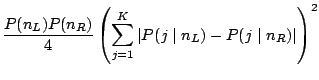
Figure 13.7 shows an overview of all possible
association rules involving three binary variables
![]() and
and ![]() . The bin in the bottom right corner
. The bin in the bottom right corner
![]() gives an example for a rule that passes most common
thresholds. It has very high confidence (the highlighting almost
fills this bin entirely), and also the support is relatively high (the
bin itself, and therefore the amount of highlighting, is large). The
leftmost bin in the upper row,
gives an example for a rule that passes most common
thresholds. It has very high confidence (the highlighting almost
fills this bin entirely), and also the support is relatively high (the
bin itself, and therefore the amount of highlighting, is large). The
leftmost bin in the upper row,
![]() , represents a rule with a comparable support (this bin
contains approximately the same amount of highlighting as the bin in
the bottom right corner), yet the confidence of the corresponding rule
is rather low (highlighting fills this bin to only one third,
approximately). All the other possible rules have even lower
confidence and their supports are also too small to be of interest.
, represents a rule with a comparable support (this bin
contains approximately the same amount of highlighting as the bin in
the bottom right corner), yet the confidence of the corresponding rule
is rather low (highlighting fills this bin to only one third,
approximately). All the other possible rules have even lower
confidence and their supports are also too small to be of interest.
To make comparisons of proportions of highlighting heights more
easily, it is much better to align all bins. This yields mosaics of
the following form: Starting from the basic rectangle, the width is
divided according to the first variable's categories and their numbers
of entries. Each of these bins is divided again and again horizontally
in the same way according to the other variables. In MANET standard
mosaic plots can be interactively rotated in this form by a simple
mouse click and therefore we call these plots rotated mosaic plots.
Highlighting splits the bins still vertically. Thus highlighting
heights in a ![]() dimensional mosaic plot of variables
dimensional mosaic plot of variables
![]() show the conditional probabilities
show the conditional probabilities
![]() .
.
In addition, to determine more easily the exact combination that a bin represents labels can be added underneath the mosaics (see Fig. 13.8). Each row of the labels corresponds to one variable, the white rectangles stand for ''0''s, the blacks for ''1''s. The first bin in Fig. 13.8 therefore represents the combination of ''no item bought'' (all ''0''s), the second bin contains all transactions, where only corned beef has been bought, and so on. This form of diagrams is also known as doubledecker plots introduced in [18].
![\includegraphics[width=9cm]{text/3-13/double.eps}](img6733.gif)
|
![\includegraphics[width=6.6cm]{text/3-13/perceptron.eps}](img6706.gif)
![\includegraphics[width=6.4cm]{text/3-13/nnet3.eps}](img6711.gif)