If conclusions based on statistical charts are to be useful,
we must identify and interpret the statistical models
underlying charts. A statistical model determines how the
location of a representation element (point, line, ![]() )
in a frame (a measurable region of representation) is computed
from the values of a variable. Statistical models usually
(but not necessarily) incorporate error terms and help us to
articulate the domains of generalizations and inferences we
make from examining a chart. [13] summarize these
issues from a data mining context. Because chart algebra is
based on statistical design algebras, it can be used to
generate statistical models for visual data mining or
predictive analytics.
)
in a frame (a measurable region of representation) is computed
from the values of a variable. Statistical models usually
(but not necessarily) incorporate error terms and help us to
articulate the domains of generalizations and inferences we
make from examining a chart. [13] summarize these
issues from a data mining context. Because chart algebra is
based on statistical design algebras, it can be used to
generate statistical models for visual data mining or
predictive analytics.
This section presents the statistical model equivalents of chart algebra expressions. In each subsection, we show the chart algebra notation on the left of each equivalence expression and the statistical model notation on the right. The terms on the left comprise varsets and the terms on the right comprise variables. Note that some symbols (e.g., +) are common to both notations but have different meanings. The general linear statistical models presented in this section are due to ([10,11]). More recent introductions to the design notation used for statistical models are ([18]) and ([21]).
In the following subsections, we assume a functional model
![]() , where
, where ![]() is a (possibly multivariate)
variable.
is a (possibly multivariate)
variable. ![]() corresponds to a varset Z, which itself might be
produced from a chart algebra expression. In statistical
terms, we sometimes call
corresponds to a varset Z, which itself might be
produced from a chart algebra expression. In statistical
terms, we sometimes call ![]() a dependent variable and
a dependent variable and
![]() and
and ![]() independent variables. In this section,
we ignore
independent variables. In this section,
we ignore ![]() and focus on expressions involving
and focus on expressions involving ![]() and
and
![]() . These expressions are used to construct statistical
models that help to predict or estimate
. These expressions are used to construct statistical
models that help to predict or estimate ![]() .
.
An example of a two-way factorial design would be the basis
for a study of how teaching method and class size affect the
job satisfaction of teachers. In such a design, each teaching
method (factor
![]() ) is paired with each class size (factor
) is paired with each class size (factor
![]() )
and teachers and students in a school are randomly assigned to
the combinations.
)
and teachers and students in a school are randomly assigned to
the combinations.
Notice that there is no interaction term involving ![]() and
and ![]() because
because ![]() is nested within
is nested within ![]() . Not all combinations of the
levels of
. Not all combinations of the
levels of ![]() and
and ![]() are defined. An example of a nested
design would be the basis for a study of the effectiveness of
different teachers and schools in raising reading
scores. Teachers are nested within schools when no teacher in
the study can teach at more than one school. With nesting,
two teachers with the same name in different schools are
different people. With crossing, two teachers with the same
name in different schools may be the same person.
are defined. An example of a nested
design would be the basis for a study of the effectiveness of
different teachers and schools in raising reading
scores. Teachers are nested within schools when no teacher in
the study can teach at more than one school. With nesting,
two teachers with the same name in different schools are
different people. With crossing, two teachers with the same
name in different schools may be the same person.
The blend operator usually corresponds to a time series design. In such a design, we predict using functions of a time series. When the blend involves dependent variables, this is often called a repeated measures design. The simplest case is a prediction based on first differences of a series. Time is not the only possible dimension for ordering variables, of course. Other multivariate functional models can be used to analyze the results of blends ([31]).
An example of a repeated measures design would be the basis for a study of improvement in reading scores under different curricula. Students are randomly assigned to curriculum and the comparison of interest involves differences between pre-test and post-test reading scores.
It would appear that analytics have little to do with the process of building a chart. If visualization is at the end of a data-flow pipeline, then statistics is simply a form of pre-processing. In our model, however, analytics are an intrinsic part of chart construction. Through chart algebra, the structure of a graph implies a statistical model. Given this model, we can employ likelihood, information, or goodness-of-fit measures to identify parsimonious models. We will explore some graphic uses of statistical models in this section.
The factorial structure of most chart algebra expressions can produce rather complex models. We need to consider strategies for selecting subset models that are adequate fits to the data. We will discuss one simple approach in this section. This approach involves eliminating interactions (products of factors) in factorial designs.
Interactions are often regarded as nuisances because they are
difficult to interpret. Comprehending interactions requires
thinking about partial derivatives. A three-way interaction
![]() , for example, means that the relation between
, for example, means that the relation between ![]() and
and
![]() depends on the level of
depends on the level of ![]() . And the relation between
. And the relation between ![]() and
and ![]() depends on the level of
depends on the level of ![]() . And the relation between
. And the relation between
![]() and
and ![]() depends on the level of
depends on the level of ![]() . Without any
interaction, we can speak about these simple relations
unconditionally. Thus, one strategy for fitting useful subset
models is to search for subsets with as few interactions as
possible. In this search, we require that any variables in an
interaction be present as a main-effect in the model.
. Without any
interaction, we can speak about these simple relations
unconditionally. Thus, one strategy for fitting useful subset
models is to search for subsets with as few interactions as
possible. In this search, we require that any variables in an
interaction be present as a main-effect in the model.
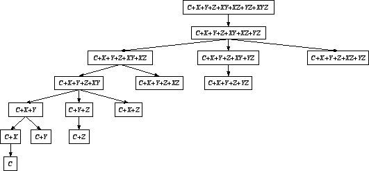
Figure 11.13 shows a submodel tree for the
three-way crossing
![]() . Not all possible
submodels are included in the tree, because the convention in
modeling factorial designs is to include main effects for
every variable appearing in an interaction. This reduces the
search space for plausible submodels. By using
branch-and-bound methods, we can reduce the search even
further. [27] and [22] cover
this area in more detail.
. Not all possible
submodels are included in the tree, because the convention in
modeling factorial designs is to include main effects for
every variable appearing in an interaction. This reduces the
search space for plausible submodels. By using
branch-and-bound methods, we can reduce the search even
further. [27] and [22] cover
this area in more detail.
Statistical modeling and data mining focus on regularity: averages, summaries, smooths, and rules that account for the significant variation in a dataset. Often, however, the main interest of statistical graphics is in locating aspects that are discrepant, surprising, or unusual: under-performing sales people, aberrant voting precincts, defective parts.
An outlier is a case whose data value and fitted value (using some model) are highly discrepant relative to the other data-fitted discrepancies in the dataset. ([4]). Casewise discrepancies are called residuals by statisticians. Outliers can be flagged in a display by highlighting (e.g., coloring) large residuals in the frame. Outliers are only one of several indicators of a poorly fit model, however. Relative badness-of-fit can occur in one or more cells of a table, for example. We can use subset modeling to highlight such cells in a display. [33] do this for log-linear models. Also, we can use autocorrelation and cross-correlation diagnostic methods to identify dependencies in the residuals and highlight areas in the display where this occurs.
Subset design modeling is most suited for deep and narrow (many rows, few columns) data tables or low-dimensional data cubes. Other data mining methods are designed for wide data tables or high-dimensional cubes ([15,17]). Subset design modeling makes sense for visualization applications because the design space in these applications does not tend to be high-dimensional. Visual data exploration works best in a few dimensions. Higher-dimensional applications work best under the guidance of other data mining algorithms.
Estimating design models requires ![]() computations with
regard to cases, because only one pass through the cases is
needed to compute the statistics for estimating the model.
Although computing design models can be worse-case
computations with
regard to cases, because only one pass through the cases is
needed to compute the statistics for estimating the model.
Although computing design models can be worse-case ![]() in the number of dimensions, sparse matrix methods can be used
to reduce this overhead because many of the covariance terms
are usually zero.
in the number of dimensions, sparse matrix methods can be used
to reduce this overhead because many of the covariance terms
are usually zero.
Smoothing data reveals systematic structure. [39] used the word in a specific sense, by pairing the two equations
We smooth data in graphics to highlight selected patterns in
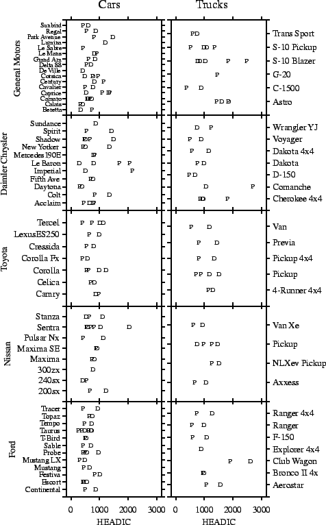
order to make inferences. We present an example involving
injury to the heads of dummies in government frontal crash
tests. Figure 11.14 shows NHTSA crash test results
for selected vehicles tested before 1999. The dependent
variable shown on the horizontal axis of the chart is the Head
Injury Index computed by the agency. The full model is
generated by the chart algebra
![]() . This expression corresponds to the model:
. This expression corresponds to the model:
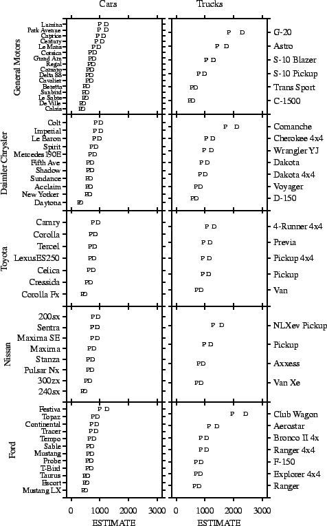
This display is difficult to interpret. We need to fit a model and order the display to reveal the results of the model fit. Fig. 11.15 charts fitted values from the following subset model: