![\includegraphics[width=1\defpicwidth]{fig111.ps}](mvahtmlimg40.gif)
The authorities have measured, as indicated in Figure 1.1,
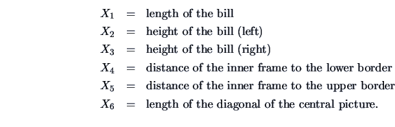
These data are taken from Flury and Riedwyl (1988). The aim is to study how these measurements may be used in determining whether a bill is genuine or counterfeit.
The authorities have measured, as indicated in Figure 1.1,
These data are taken from Flury and Riedwyl (1988). The aim is to study how these measurements may be used in determining whether a bill is genuine or counterfeit.
The boxplot is a graphical technique that displays the distribution of variables. It helps us see the location, skewness, spread, tail length and outlying points.
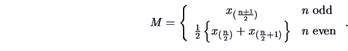
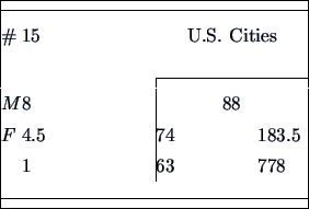
It is particularly useful in comparing different batches. The boxplot is a graphical representation of the Five Number Summary. To introduce the Five Number Summary, let us consider for a moment a smaller, one-dimensional data set: the population of the 15 largest U.S. cities in 1960 (Table 1.1).
|
In the Five Number Summary,
we calculate the upper quartile ![]() ,
the lower quartile
,
the lower quartile ![]() , the median and the extremes. Recall that
order statistics
, the median and the extremes. Recall that
order statistics
![]() are a
set of ordered values
are a
set of ordered values
![]() where
where
![]() denotes the minimum and
denotes the minimum and ![]() the maximum.
The median
the maximum.
The median ![]() typically cuts the set of observations
in two equal parts, and is defined as
typically cuts the set of observations
in two equal parts, and is defined as
 |
(1.1) |
We proceed in the same way to get
the fourths. Take the depth of the median and calculate
![\begin{displaymath}\textrm{depth of fourth }=\frac{[\textrm{depth of median}]+1}{2}\end{displaymath}](mvahtmlimg71.gif)
The ![]() -spread,
-spread, ![]() , is defined as
, is defined as ![]() .
The outside bars
.
The outside bars
| (1.2) | |||
| (1.3) |
| (1.4) | |||
| (1.5) | |||
| (1.6) |
In the U.S. cities example the cutoff points (outside bars) are at ![]() and 349, hence we draw whiskers to New Orleans and Los Angeles.
We can see from Figure 1.2
that the data are very skew: The
upper half of the data (above the median) is more spread out than the
lower half (below the median). The data contains two outliers marked
as a star and a circle. The more distinct outlier is shown as a star.
The mean (as a non-robust measure of location) is pulled
away from the median.
and 349, hence we draw whiskers to New Orleans and Los Angeles.
We can see from Figure 1.2
that the data are very skew: The
upper half of the data (above the median) is more spread out than the
lower half (below the median). The data contains two outliers marked
as a star and a circle. The more distinct outlier is shown as a star.
The mean (as a non-robust measure of location) is pulled
away from the median.
![\includegraphics[width=1\defpicwidth]{boxcar.ps}](mvahtmlimg99.gif)
|
Boxplots are very useful tools in comparing batches. The relative location of the distribution of different batches tells us a lot about the batches themselves. Before we come back to the Swiss bank data let us compare the fuel economy of vehicles from different countries, see Figure 1.3 and Table B.3.
The data are from the second column of Table B.3 and show
the mileage (miles per gallon) of U.S. American,
Japanese and European cars. The five-number summaries for these data sets
are
![]() ,
,
![]() ,
and
,
and
![]() for American, Japanese, and European cars, respectively.
This reflects the information shown in Figure 1.3.
The following conclusions can be made:
for American, Japanese, and European cars, respectively.
This reflects the information shown in Figure 1.3.
The following conclusions can be made:
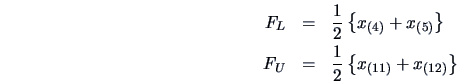
Now let us apply the boxplot technique to the bank data
set. In Figure 1.4 we show the parallel
boxplot of the diagonal variable ![]() .
On the left is the value of the genuine bank notes and on the right the
value of the counterfeit bank notes. The two five-number summaries are
.
On the left is the value of the genuine bank notes and on the right the
value of the counterfeit bank notes. The two five-number summaries are
![]() for the genuine bank notes,
and
for the genuine bank notes,
and
![]() for the counterfeit ones.
for the counterfeit ones.
One sees that the diagonals of the genuine bank notes tend to be larger.
It is harder to see a clear distinction when comparing the length
of the bank notes ![]() , see Figure 1.5. There are a few outliers
in both plots. Almost all the observations of the diagonal of the
genuine notes are above the ones from the counterfeit. There is one
observation in Figure 1.4 of the genuine notes that is almost
equal to the median of the counterfeit notes.
Can the parallel boxplot technique help us distinguish between the two types
of bank notes?
, see Figure 1.5. There are a few outliers
in both plots. Almost all the observations of the diagonal of the
genuine notes are above the ones from the counterfeit. There is one
observation in Figure 1.4 of the genuine notes that is almost
equal to the median of the counterfeit notes.
Can the parallel boxplot technique help us distinguish between the two types
of bank notes?
![\includegraphics[width=1\defpicwidth]{boxcity.ps}](mvahtmlimg97.gif)
![\includegraphics[width=1\defpicwidth]{boxbank6.ps}](mvahtmlimg103.gif)
![\includegraphics[width=1\defpicwidth]{boxbank1.ps}](mvahtmlimg107.gif)