1.6 Andrews' Curves
The basic problem of graphical displays of multivariate data is the
dimensionality. Scatterplots work well up to three dimensions (if we use
interactive displays). More than three dimensions have to be coded
into displayable 2D or 3D structures (e.g., faces). The idea of coding and
representing multivariate data by curves was suggested by
Andrews (1972). Each multivariate
observation
 is transformed into a curve
as follows:
is transformed into a curve
as follows:
 |
(1.13) |
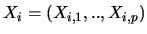
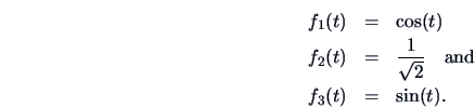
such that the observation represents the coefficients of a so-called
Fourier series (
![$t \in [-\pi,\pi]$](mvahtmlimg187.gif) ).
).
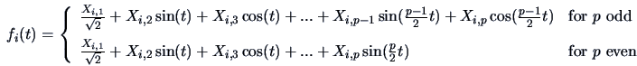
Suppose that we have three-dimensional observations:
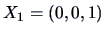 ,
,
 and
and
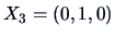 .
Here
.
Here  and the following representations correspond to the
Andrews' curves:
and the following representations correspond to the
Andrews' curves:
These curves are indeed quite distinct,
since the observations  ,
,  , and
, and  are
the 3D unit vectors: each observation has mass only in one of the
three dimensions.
The order of the variables plays an important role.
are
the 3D unit vectors: each observation has mass only in one of the
three dimensions.
The order of the variables plays an important role.
EXAMPLE 1.2
Let us take the 96th observation of the Swiss bank note data set,
The Andrews' curve is by (
1.13):
Figure:
Andrews' curves of the observations 96-105
from the Swiss bank note data. The order of the variables is
1,2,3,4,5,6.
 MVAandcur.xpl
|
|
Figure 1.20 shows the Andrews' curves for observations
96-105 of the Swiss bank note data set. We already know that the
observations 96-100 represent genuine bank notes, and that the
observations 101-105 represent counterfeit bank notes. We see
that at least four curves differ from the others, but it is
hard to tell which curve belongs to which group.
We know from
Figure 1.4 that the sixth variable is an important one. Therefore,
the Andrews' curves are calculated again using
a reversed order of the variables.
EXAMPLE 1.3
Let us consider again the 96th observation of the Swiss bank note data set,
The Andrews' curve is computed using the reversed order of
variables:
In Figure
1.21 the curves

-

for observations 96-105 are plotted.
Instead of a difference in high frequency,
now we have a difference in the intercept, which makes it more difficult
for us to see the differences in observations.
Figure:
Andrews' curves of the observations 96-105 from the
Swiss bank note data.
The order of the
variables is 6,5,4,3,2,1.
MVAandcur2.xpl
|
|
This shows that the order of the variables plays
an important role for the interpretation.
If  is high-dimensional, then the last variables will have only a small visible
contribution to the curve. They fall into the high frequency part of the curve.
To overcome this problem Andrews suggested using an order which is
suggested by Principal Component Analysis. This technique will be
treated in detail in Chapter 9. In fact, the sixth variable will appear there as the most
important variable for discriminating between the two groups.
If the number of observations is more than 20, there may be too many
curves in one graph. This will result in an over plotting of curves
or a bad ``signal-to-ink-ratio'', see Tufte (1983).
It is therefore advisable to present multivariate observations via
Andrews' curves only for a limited number of observations.
is high-dimensional, then the last variables will have only a small visible
contribution to the curve. They fall into the high frequency part of the curve.
To overcome this problem Andrews suggested using an order which is
suggested by Principal Component Analysis. This technique will be
treated in detail in Chapter 9. In fact, the sixth variable will appear there as the most
important variable for discriminating between the two groups.
If the number of observations is more than 20, there may be too many
curves in one graph. This will result in an over plotting of curves
or a bad ``signal-to-ink-ratio'', see Tufte (1983).
It is therefore advisable to present multivariate observations via
Andrews' curves only for a limited number of observations.
Summary

- Outliers appear as single Andrews' curves that look different
from the rest.
- A subgroup of data is characterized by a set of simular curves.
- The order of the variables plays an important role for interpretation.
- The order of variables may be optimized by Principal Component
Analysis.
- For more than 20 observations we may obtain a bad
``signal-to-ink-ratio'', i.e., too many curves are overlaid in
one picture.

![\includegraphics[width=1\defpicwidth]{andcur.ps}](mvahtmlimg196.gif)

![\includegraphics[width=1\defpicwidth]{andcur2.ps}](mvahtmlimg200.gif)