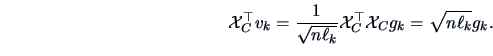
The empirical PCs (normalized or not) turn out to be equivalent to the factors
that one would obtain by decomposing the appropriate data matrix
into its factors (see Chapter 8).
It will be shown that the PCs are the factors
representing the rows of the centered data matrix
and that the NPCs correspond
to the factors of the standardized data matrix.
The representation of the columns
of the standardized data matrix provides (at a scale factor) the correlations
between the NPCs and the original variables. The derivation of the (N)PCs
presented above will have
a nice geometric justification here since they are the
best fit in subspaces generated by the columns of the (transformed) data matrix
![]() . This analogy provides complementary interpretations of the
graphical representations shown above.
. This analogy provides complementary interpretations of the
graphical representations shown above.
Assume, as in Chapter 8, that we want to obtain
representations of the individuals (the rows of ![]() ) and
of the variables (the columns of
) and
of the variables (the columns of ![]() ) in spaces of smaller
dimension. To keep the representations simple,
some prior transformations are performed. Since the origin has no particular
statistical meaning in the space of individuals, we will first shift
the origin to the center of gravity,
) in spaces of smaller
dimension. To keep the representations simple,
some prior transformations are performed. Since the origin has no particular
statistical meaning in the space of individuals, we will first shift
the origin to the center of gravity, ![]() , of the point
cloud.
This is the same as analyzing the centered data matrix
, of the point
cloud.
This is the same as analyzing the centered data matrix
![]() .
Now all of the variables have zero means, thus the technique used in
Chapter 8 can be applied to the matrix
.
Now all of the variables have zero means, thus the technique used in
Chapter 8 can be applied to the matrix ![]() . Note that
the spectral decomposition of
. Note that
the spectral decomposition of
![]() is related
to that of
is related
to that of ![]() , namely
, namely
| (9.28) |
| (9.29) |
| (9.30) | |||
| (9.31) |
The representation of the variables can be obtained using the Duality
Relations (8.11), and (8.12).
The projections of the columns of
![]() onto the eigenvectors
onto the eigenvectors ![]() of
of
![]() are
are
 |
(9.32) |
| (9.33) |
| (9.34) | |||
| (9.35) |
The NPCs can also be viewed as a
factorial method for reducing the dimension.
The variables are again standardized so that each one has mean zero and
unit variance and is independent of the scale of the variables. The factorial
analysis of ![]() provides the NPCs. The spectral decomposition of
provides the NPCs. The spectral decomposition of
![]() is related to that of
is related to that of ![]() , namely
, namely
The representation of the variables are again given by the columns of
This implies that a deeper interpretation of the representation of
the individuals can be obtained by looking
simultaneously at the graphs plotting the variables. Note
that
| (9.38) | |||
| (9.39) |
| (9.40) |
As said before, an overall measure of the quality of the
representation is given by
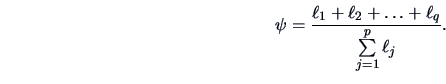
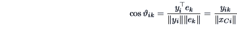
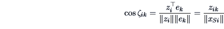
It can be useful to check if each individual is well represented
by the PCs. Clearly, the proximity of two individuals on the projected
space may not necessarily coincide with the proximity
in the full original space ![]() , which
may lead to erroneous interpretations of the graphs.
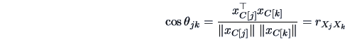
In this respect, it is worth computing the angle
, which
may lead to erroneous interpretations of the graphs.
In this respect, it is worth computing the angle
![]() between the representation of an individual
between the representation of an individual ![]() and the
and the ![]() -th PC or NPC axis. This can be done using (2.40),
i.e.,
-th PC or NPC axis. This can be done using (2.40),
i.e.,
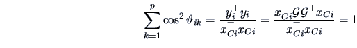
We already know that the quality of the representation of the variables can
be evaluated by the percentage of ![]() 's variance that is
explained by a PC, which is given by
's variance that is
explained by a PC, which is given by ![]() or
or ![]() according to (9.16) and (9.27) respectively.
according to (9.16) and (9.27) respectively.
Calculating the matrix
![]() we have
we have
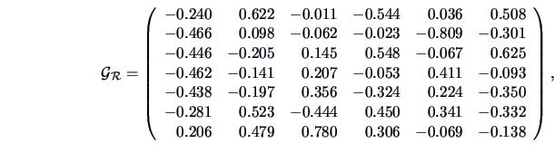
|
The interpretation of the principal components are best understood
when looking at the correlations between the original ![]() 's and the PCs.
Since the first two PCs explain 88.1% of the variance, we limit
ourselves to the first two PCs. The results are shown in Table 9.4.
's and the PCs.
Since the first two PCs explain 88.1% of the variance, we limit
ourselves to the first two PCs. The results are shown in Table 9.4.
|
The plots are the projections of the variables into ![]() .
Since the quality of the representation
is good for all the variables (except maybe
.
Since the quality of the representation
is good for all the variables (except maybe ![]() ), their relative angles
give a picture of their original correlation:
wine is negatively correlated with the vegetables, fruits, meat and
poultry groups (
), their relative angles
give a picture of their original correlation:
wine is negatively correlated with the vegetables, fruits, meat and
poultry groups (![]() ), whereas taken individually this
latter grouping of variables are highly positively
correlated with each other (
), whereas taken individually this
latter grouping of variables are highly positively
correlated with each other (
![]() ).
Bread and milk are positively correlated
but poorly correlated with meat, fruits and poultry (
).
Bread and milk are positively correlated
but poorly correlated with meat, fruits and poultry (
![]() ).
).
Now the representation of the individuals
in Figure 9.7 can be interpreted better.
From Figure 9.8
and Table 9.4 we can see that the the first factor ![]() is a
vegetable-meat-poultry-fruit factor (with a negative sign),
whereas the second factor
is a milk-bread-wine factor (with a positive sign).
Note that this corresponds to the most important
weights in the first columns of
is a
vegetable-meat-poultry-fruit factor (with a negative sign),
whereas the second factor
is a milk-bread-wine factor (with a positive sign).
Note that this corresponds to the most important
weights in the first columns of
![]() .
In Figure 9.7 lines were drawn to
connect families of the same size and families of the same
professional types. A grid can clearly be seen (with a
slight deformation by the manager families) that shows the families
with higher expenditures (higher number of children) on the left.
.
In Figure 9.7 lines were drawn to
connect families of the same size and families of the same
professional types. A grid can clearly be seen (with a
slight deformation by the manager families) that shows the families
with higher expenditures (higher number of children) on the left.
Considering both figures together explains what types of expenditures are responsible for similarities in food expenditures. Bread, milk and wine expenditures are similar for manual workers and employees. Families of managers are characterized by higher expenditures on vegetables, fruits, meat and poultry. Very often when analyzing NPCs (and PCs), it is illuminating to use such a device to introduce qualitative aspects of individuals in order to enrich the interpretations of the graphs.
![\includegraphics[width=1\defpicwidth]{npcafood.ps}](mvahtmlimg2861.gif)
![\includegraphics[width=1\defpicwidth]{food2.ps}](mvahtmlimg2862.gif)